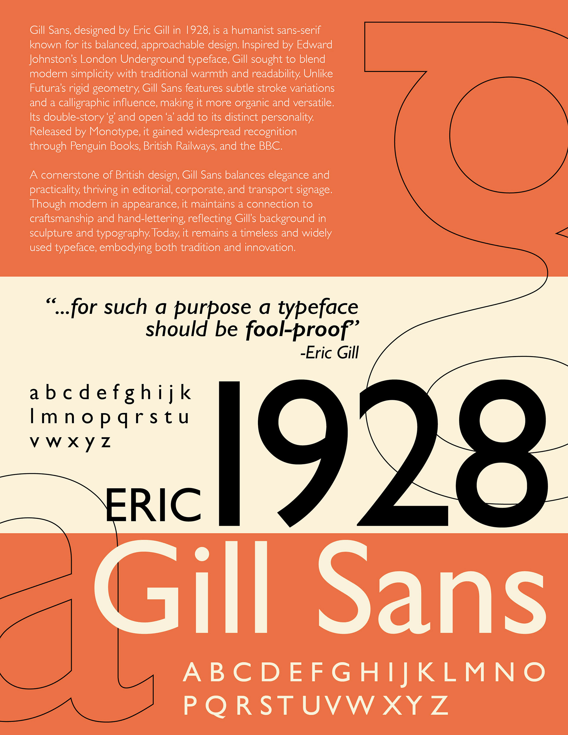
For this project, I was tasked with creating a poster for a typeface of my choosing. I choose to do gill sans because I liked the font use in penguin books. The requirements for this poster were to include the founder of the typeface, the year it was published, a short paragraph about the typeface, the capital letters, lowercase letters, and special characters, along with any information on it we saw fit.
RESEARCH
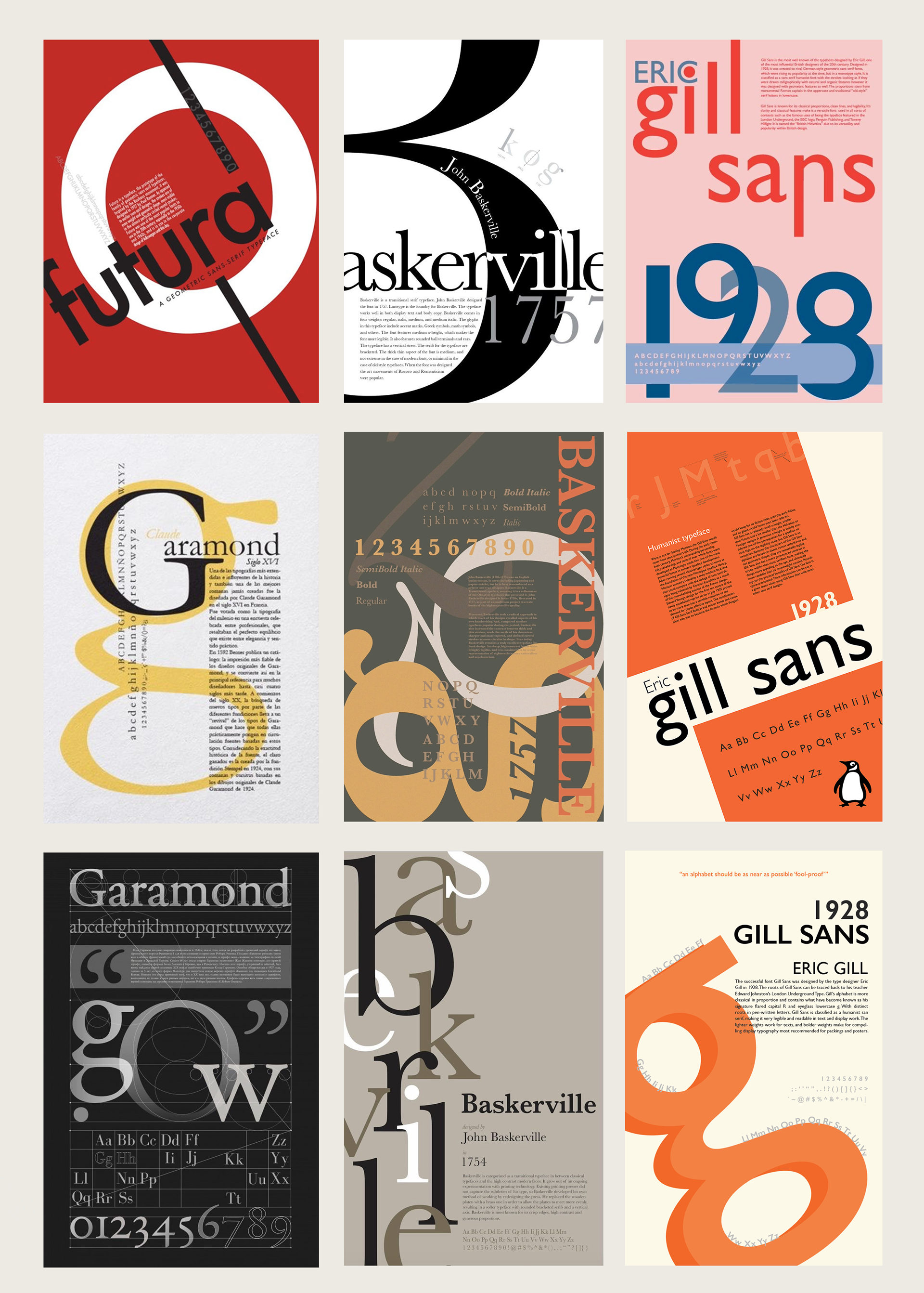
It was difficult to research this as I was unfamiliar with typeface posters, and was not confident in my ability to take this much information and arrange it in a way that was aesthetically pleasing.
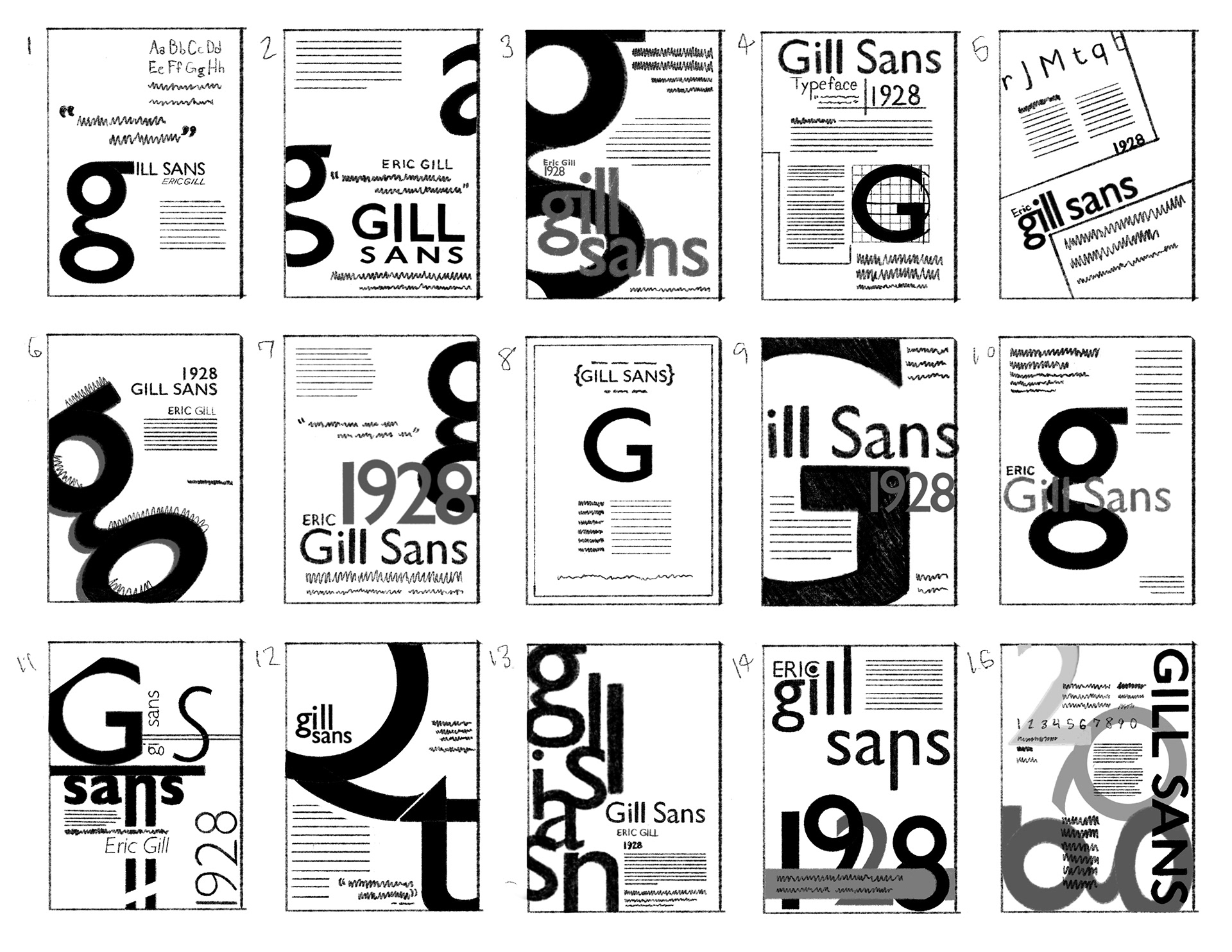
SKETCHES
After all the research, I started exploring how to set up the composition in a way that was both eye catching and pleasing. I ended up copying a few compositions to meet the deadline of 16 total sketches, but chose my own original composition to move forward with.
FINAL DESIGN
For my final design, I used the coloring common on penguin books, as that was the most influential use of gill sans, and many others who. have done gill sans posters used the same color combination. While I need up with an interesting composition and a well balanced poster, I feel like this was one of the most challenging projects I've undertaken, as I felt overwhelmed by the amount of information, as well as the composition. I also copied some posters in my sketches so that I could turn in this assignment on time, which contributed to my lack of confidence in creating new ideas. Going forward, I plan to let myself be more creative and less closed in when coming up with ideas. I feel like since I began with the sketches being too perfect, it prevented me from exploring ideas.